Fountain Pen Day Project: Starting my Ink Swatch Library
Belated happy Fountain Pen Day! How did you all celebrate fountain pens last Friday (Fountain Pen Day is celebrated on the first Friday in November), and throughout the weekend?
I ended up creating an ink swatch library using some plastic trading card pages, and manually cutting up my loose Tomoe River 52gsm paper into trading card shapes. I’d seen the idea online, either on Instagram, Mastodon, or YouTube (wish I could remember where exactly 😅) and was super excited about it because it solved the problem I was originally wrestling with when thinking about ink journals and other such notebooks: How can I predict how much space I need for each color family’s swatches, since I wanted to group them roughly by color? I did not want to randomly add swatches as I go, and then have to search all over the notebook for a given swatch. In this way, I can easily add or remove pages and rearrange swatches. I could’ve done something like those old Rolodexes with the removable cards, but this set up has a few advantages:
I’m using Tomoe River paper, my preferred paper to really see ink properties; they wouldn’t work that well in a Rolodex, given the thinness of the paper
I can easily see swatches side by side on a page and discern differences in tone, shading, etc.
Pages of 9 “cards” allows for less bulky storage, as opposed to a rotating stack of cards
I thought I’d blast through and swatch my whole library over the weekend, but I decided to do multiple casual sessions and have only gotten through the ink bottles below (haven’t even started on my ink samples yet). Counting 50 inks so far, I really did not realize how many inks I have! 😅 I still have several bottles to go including 25 small ones from last year’s Diamine Inkvent. Granted, some like the Herbin and Pilot Iroshizuku inks are small bottles, but many of them are regular 30+ mL.
Grouping by color family is helpful, but I’ve already seen a few inks that are either chromoshading, or non-typical shades that could fall under multiple color families. I was toying with the idea of tagging the swatch cards with symbols to show multiple color families and properties like shimmer or sheen, but I will probably leave that to a digital database version of my ink library where it would be easier to take advantage of the tags for filtering and sorting. This ink swatch library is primarily to remind me of what the inks look like on paper.
It’s super satisfying to look at and flip through these full pages of swatch “cards”, like seeing full pages of collected Animal Crossing Amiibo cards. 🙂 I’ll have to figure out a better way of cutting my A5 TRP sheets down to 4 cards. Been doing it manually because I didn’t want to mess with creating printable templates initially. It was a nice, zen activity to trace out the shapes, swatch the inks, then cut out the cards when the ink dried. I probably could buy a rounded corner punch and just cut the sheets of paper into rectangles and finish off the corners afterwards. Perhaps that’ll be the next improvement for the workflow.
First up, greens…and teals (I did not tweak the color rendition in this picture, so some of these swatches may look more blue than they are in reality). You can also see a couple blue swatches at the bottom showing through from the blue page behind. I’m surprised I have this many, considering green isn’t a favorite color.
Next, blue inks. I keep looking at Blushing Mushroom and thinking it shouldn’t be here, but I decided on blue for now. It’s probably better on the purple page instead, given how much the pink tones push it towards purple, at least in this picture.
Purples and berries. I’ll likely separate the more pink colors from the darker purples, but for now they’re all together.
Partial 2nd page of purples and berries. Even though I was trying not to go overboard getting purple inks, I apparently still have several compared to the other color families (at least, so far).
Yellows and browns. Again, I’m surprised I have this many of each color, though, I at least have been on the lookout for nice, sunny or caramel-y yellows.
Grays, again with some reds from the page behind peeking through
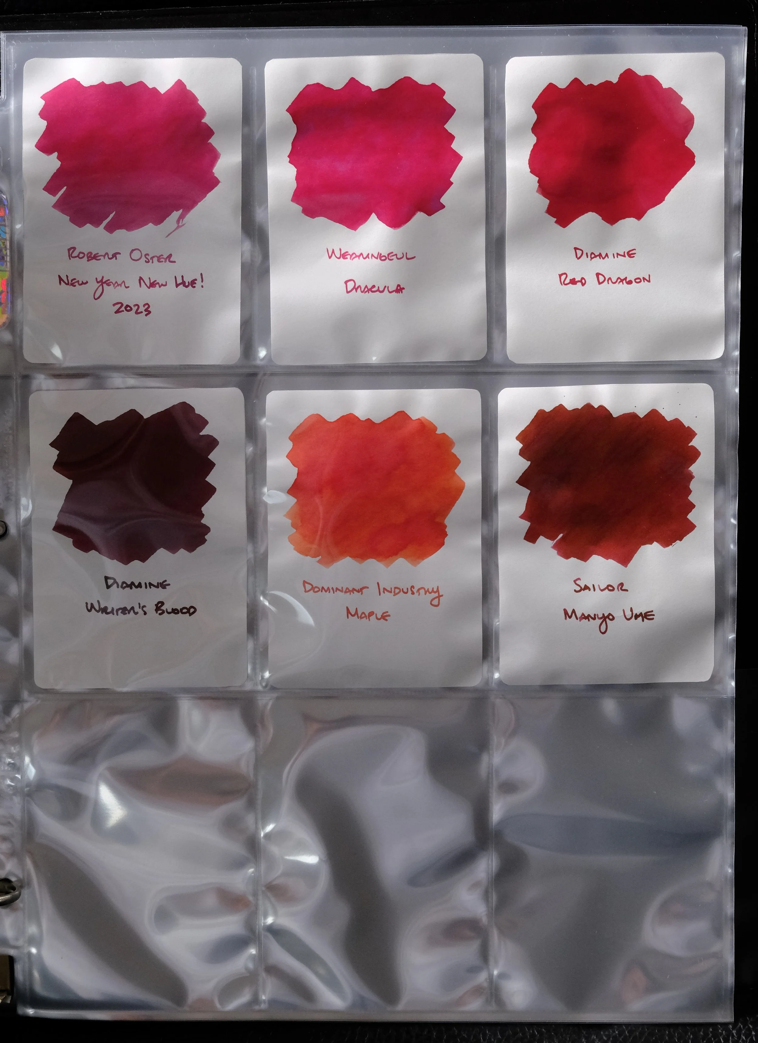
Reds, surprisingly one of my least favorite color families. I like red in general but I find a lot of red inks (that don’t have berry or burgundy tones) look a lot like different shades of blood, which is just really unappealing, especially when they dry brownish. 🤢
How do you all keep your ink swatches? Do you use a bound book and leave blank pages for each color family, or swatch as you go, or do something else? Would love to hear more ideas.


