Monty Winnfield Utility Nib: First Impressions
Yay, I got my first Monty Winnfield nib, the Utility nib, yesterday! I’d been admiring this maker’s work for a long time now, but a lot of the nibs are a) quite expensive, and b) often sold out. So when I saw the post on IG touting that these Utility nibs were available and were under $50, I jumped into action and ordered one so fast. It got here so fast, as well. I ordered on Saturday and got the nib on Tuesday. Nice.
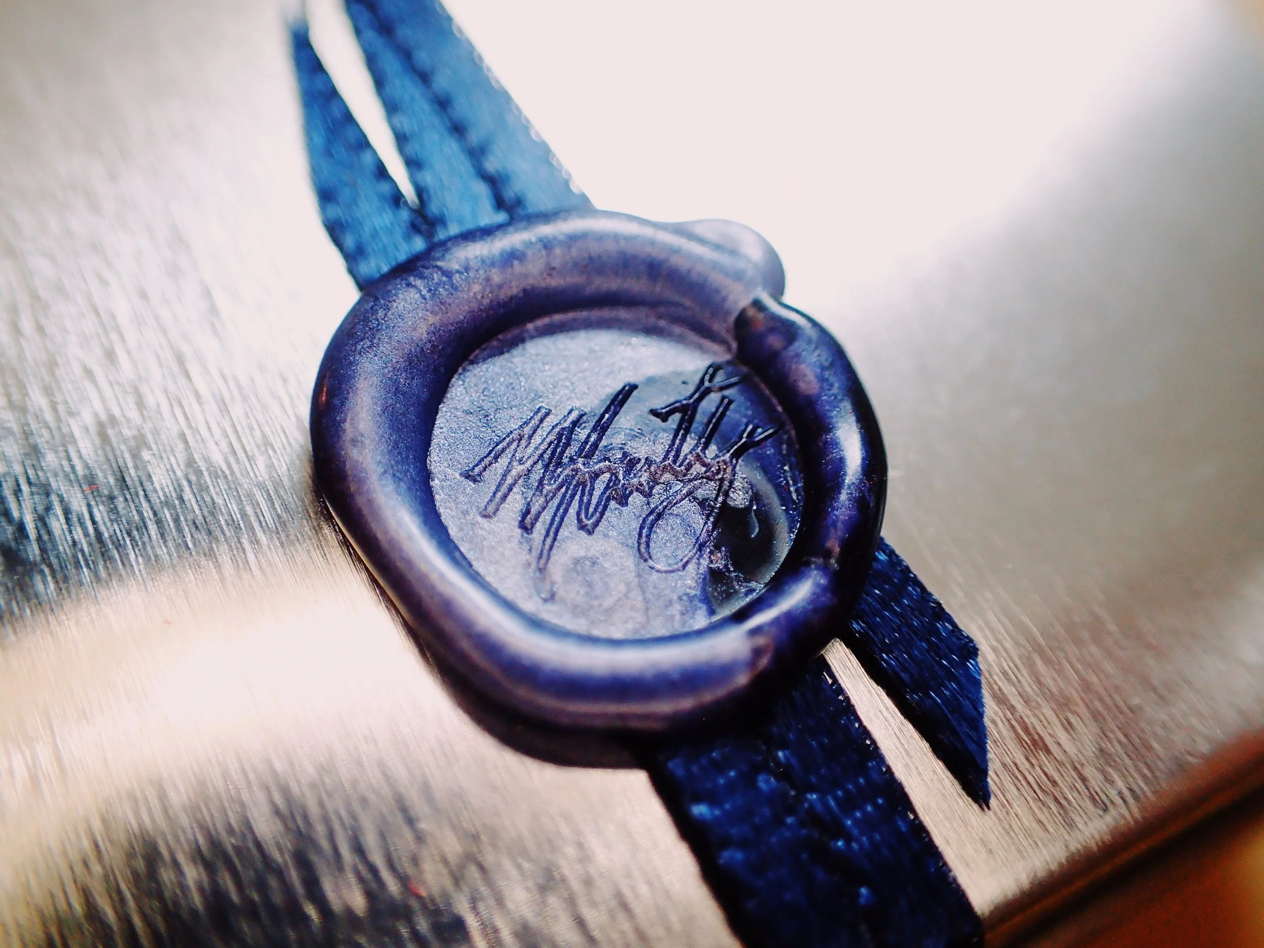
As you can see, it came in a cute little tin with a tiny, tiny wax seal. 🤩 There was much cooing upon seeing this.
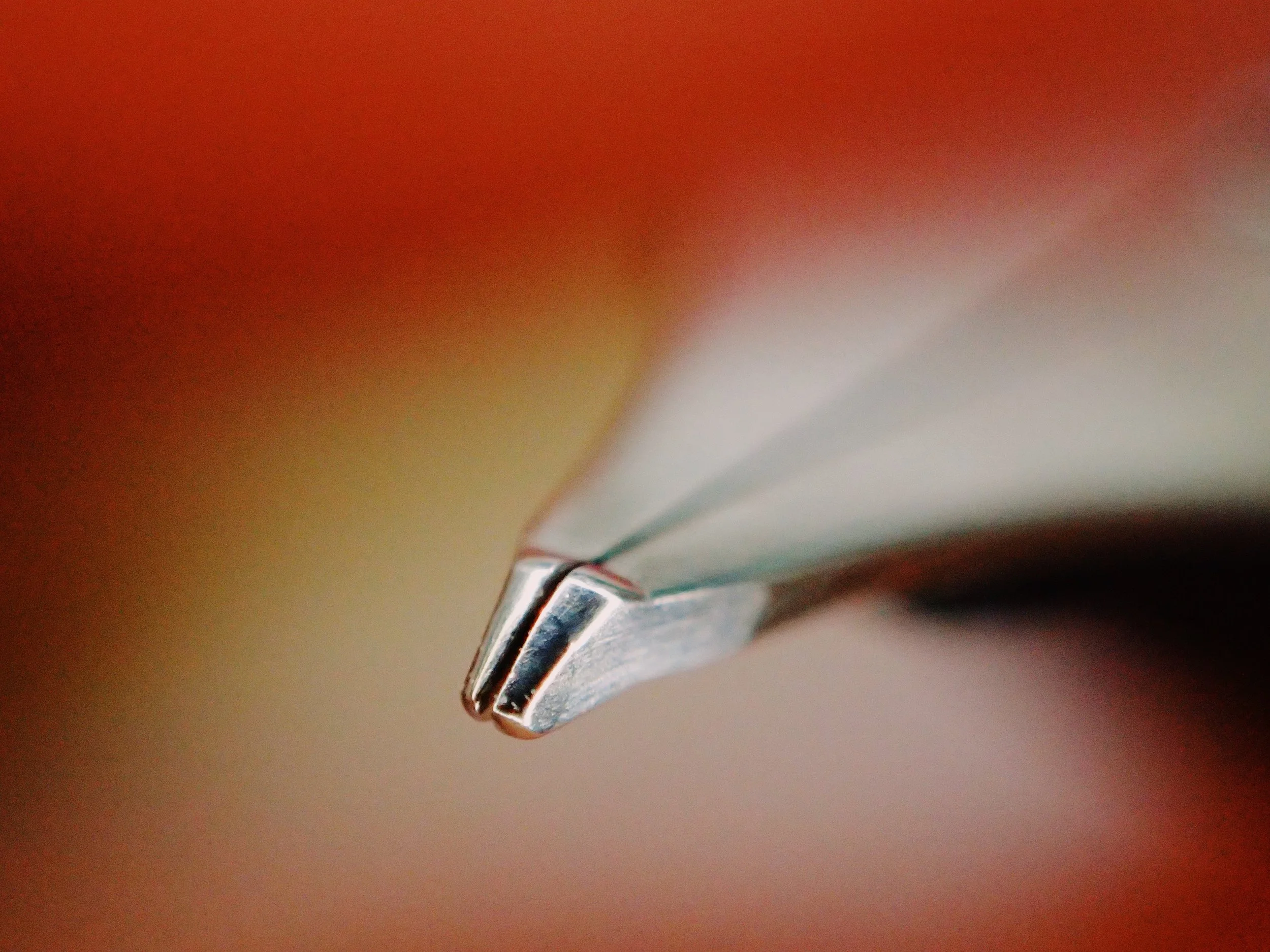
Inside was a red pouch housing the shiny, new nib. Here’s a super-macro shot of the tip:
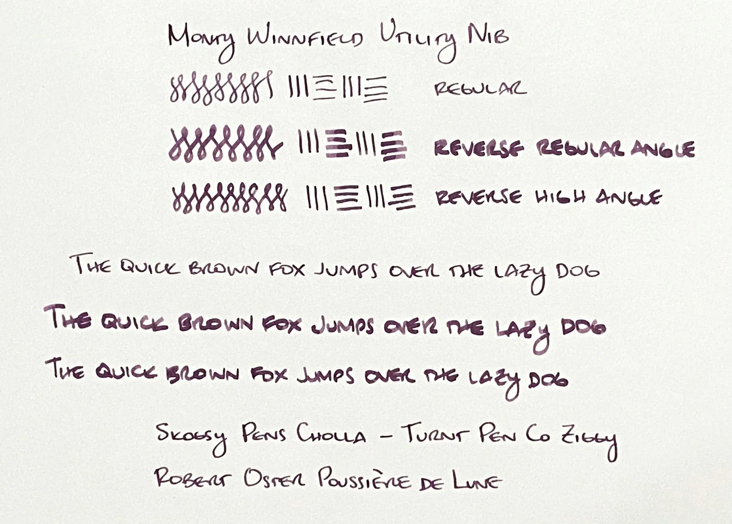
When writing normally, it writes an extra-fine line (by Western fountain pen standards). On the reverse, it writes a broad line, as you can guess from the top slope of the nib.
At first I put the nib in my Leonardo Momento Zero, but the housing needed to be screwed in further than the edge of the section, so that meant the converter didn’t have the same clearance when it was screwed in, so the section itself could not be screwed in all the way. It all fit together enough to be used, but I wasn’t comfortable leaving it like that. I ended up swapping it into my Skogsy Pens Cholla (purchased recently at the SF pen show), seen below:
It fits this pen much better (sorry SF-exclusive, engraved nib that used to reside in the Cholla). This works out well, since I wasn’t writing too much with the Cholla because the SF show nib I got writes very wet, too wet. I’ll have to get it ground to something more interesting someday.
Anyway, I admit that I don’t write with either extra-fine or broad nibs that much, and that I really wanted to get this because it was the least expensive way to break into the Monty Winnfield brand. However, I find I am happy with the line widths achievable with this nib, not least because the extra-fine side has a bit of an italic feel/look, and the broad side writes like an architect, at least to my eye. Both the italic and architect lines fit well with my block caps writing.
I think this nib grind would be considered a reverse broad architect. I have a broad architect grind from someone on r/Pen_Swap, and it writes similarly to this but flipped, with the broad architect on the normal side and italic extra-fine line on the reverse. I think the Utility nib has a more usable configuration for my small handwriting.
Ignore the color of the ink here (and the writing sample below). I optimized for legibility and fixing the white balance of a poorly-lit indoor shot.
As you can see, the reverse of the nib writes pretty broad, but if you use a higher writing angle, you can tame the line width, and it looks better matched with my small writing.
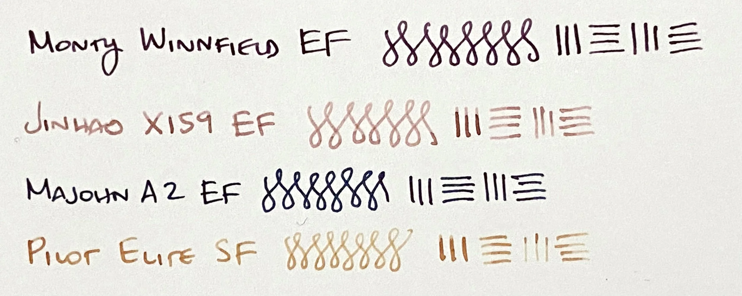
Below is a comparison with other extra-fine nibs (and one Japanese fine nib) that I have. You can see the ever-so-slightly italic look of the Utility nib compared to the regular EFs. And at the bottom is the Pilot soft-fine nib which is comparable to the other EFs.
Image from montywinnfield.com
I’ve only had the nib for a day, so these are my quick first impressions:
Likes
Fast shipping
Great packaging that feels special
Extremely well-made
Awesome italic and architect grinds that work well with my writing
The feedback on the EF side is noticeable, but pleasant
It feels special to write with, which I suppose is how one would feel about any custom-ground nib (of which I have very few)
Minor nitpicks
The titanium housing looks awesome and feels rock solid. But the part that connects with the ink converter is slightly too big compared to a regular plastic housing, so you really have to jam the two together to get them to fit. I’m concerned that with repeated removal and reconnection, the opening of the converter may get too loose and start to leak, but I’ll keep an eye on this.
IIRC, this nib will only fit this housing, so if the housing does not fit your pen well, you cannot pull the nib and put it in a different housing, something to be aware of.
The nib looks super clean with no branding or engraving, but some people who like the look of branded nibs may not like this very minimalist look. Personally, I like the difference of it compared to all my other fountain pen nibs.
If I observe anything else after using this nib for a while, I’ll report back.
The Utility nib appears to be sold out at the time I’m writing this post, but the maker mentioned that the nib is not considered a custom nib, therefore it will be regularly restocked. The next nib I’ll want to pick up is the Engineer Nib, an architect grind, then probably a Vario nib, a flex nib. It never ends! 😀


