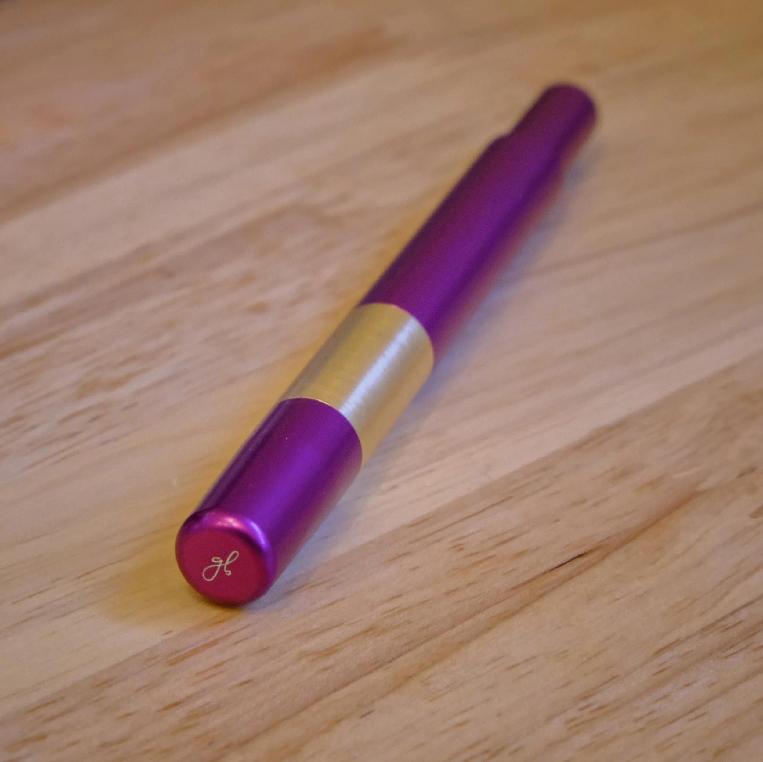
The Good Blue L130 Amethyst, Cult Pens exclusive
Yay, I got my L130 Amethyst with a zoom nib by The Good Blue today! Just a quick post here to share some pictures and writing sample. Since it came from Cult Pens in the UK, shipping kinda took its time, but it arrived safely.
My quick first impression of the pen is that it obviously feels well-built and solid, thanks to the aluminum and brass construction. The brass section makes it feel heavier than most of the pens I have, so I’ll have to get used to the extra weight. Not sure how fatigued my hand will get writing with it. The small cap fits onto the “peg” at the back of the pen and is held there by gravity and friction instead of by threads, so if you flip your pen upside down, the cap will slowly fall off. The metal section has a texture as you can see in the pictures, so it doesn’t feel slippery when writing.
The Good Blue’s logo seen at the top of the cap
The L130 uncapped
The inscription for the limited edition number is very faint and hard to capture, lucky number 13 out of 50
Here’s a quick writing sample on a sheet of Kokuyo Business paper (which has similar ink performance as Tomoe River paper, in my experience) after inking the pen with Diamine Jingle Berry, a pretty close match for the magenta-purple pen body. At around a 45 to 60-degree writing angle, there’s noticeable line variation between vertical and horizontal lines. In practice, it performs similarly to how an architect grind performs (to me). At around a 90-degree writing angle, the nib has no line variation between horizontal and vertical lines, and writes like a (Western?) fine nib.
I added a 90-degree writing angle sample of “the quick brown fox”, and some reverse writing below it. On the Kokuyo Business paper, the ink feels drier than on Regalia paper in my Endless Recorder notebook (my current journal), so reverse writing felt a bit patchy. On Regalia paper it worked better, since that paper makes nibs write wetter. However, overall Diamine Jingle Berry feels dry in this nib. Initially I dipped the pen in Herbin Poussiere de Lune for testing, and that ink felt wetter than Jingle Berry. I could’ve put Pilot Iroshizuku Yama-Budo in this pen, but on the Regalia paper it would be too wet. I’ll try it later.
At first I was slightly disappointed that the pen didn’t have the option of adding a flex nib since that’s what I am curious about most from The Good Blue pens, but given the architect-like performance of their zoom nib, I think it ends up being a better everyday writing option, since I have other architect or “long blade” nibs on other pens and greatly enjoy the line variation they offer for my writing style. Sometime later, I’ll try buying a flex nib from The Good Blue to try out in this pen, but for now, I’m happy with it. ✒️✨


